As you can see it is pretty intimidating, the majority of users sees this interface and runs back to GIMP's more expensive alternatives. Even though GIMP has most of the features of the more expensive softwares. Most back end developers I encountered would hear good things about GIMP, download the software. Get all excited about it, then when they first open it, their reaction is what in the world !@#$$$ (NC-17 censored) is this. They would go back and use paint as their photo editor. Which is a shame, because GIMP is quite powerful.
However, there's a very easy solution to this UI dilemma and make GIMP more user friendly.
Step-By-Step Instructions:
- Click → Windows → Single Window Mode
- GIMP will dock all the floating windows into a single window, looking like all the other conventional programs that you are used to
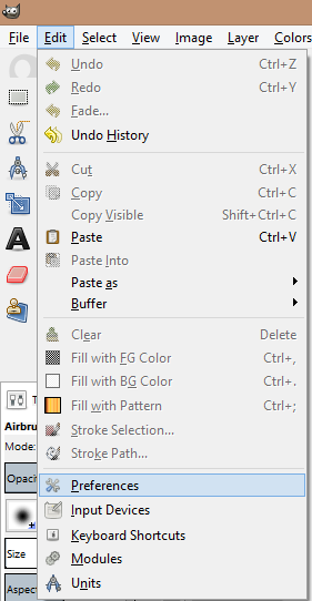
3. The next step is optional, if you feel more comfortable with the single window mode, you can save the current positions by clicking on Edit → Preferences
4. In the Preferences dialog, select "Window Management", then click on the button "Save Window Postions Now", make sure the "Save window positions on exit" is checked, then click "OK"
5. Now close GIMP and open it again, you will see that the single window mode is used instead of the default view.


No comments:
Post a Comment